Designing / decorating a WTreeView
Added by Michael Leitman almost 14 years ago
hey there :)
I am very new to wt, but first i want to say it is amazing :-o
For our new project, we want to use this technology on embedded systems.
I just played a little around with a few widgets and CSS formating,
but, i must say, i am barely new to these things such as boost C and XHTML/CSS :-/
(worked a lot with C/CLI in .net the last few years)
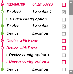
I was trying to design a TreeView for the UserGUI (got the design Layout specification from our designer), representing some Devices and, if accessible, the possible configurations.
(i am adding a picture for further convenience "Forum_Tree.png")
Basically we use a parent node for each connected device, a "column" (?) for the location (e.g. ip adress) and a CheckBox to select it for multiple editing.
If the device has configuration options, it has an expandable Icon (+, if allready expanded -), if not, there is just a filled circle.
Assume, there is an error in one of the configurations of the device, the icon is red and also the Node Text, if everything is ok, Font color should be black, Icon in green.
So, we want to visualize in the tree, which configuration is not correct.
I managed to set the images of the Nodes (either with WStandardItem->setIcon() or using CSS .Wt-treeview .Wt-expand ... background: url(img.png)).
But, when it comes to the point where decorating the Lines (originally in a tree those dotted, connecting each Node) i need some help :-s
Is it possible to define these lines with a different color/thickness for each Node (depending whether it is a parent or child, has invalid configurations and depending on the previous/following node) ?
Either with CSS and/or using images?
Or, would a Table better fits this case?
At least, i want to apologize, English is not my mother tongue,
so if you don't understand what i mean or something is looking weird, please ask and i will try to explain with other words =)
thanks for any help,
- the incredible Leitman
| Forum_Tree.png (192 KB) Forum_Tree.png | Design for the device Tree |
Replies (9)
RE: Designing / decorating a WTreeView - Added by Michael Leitman almost 14 years ago
Sorry, for double posting,
but i didn't find an option to edit my post?
I just wanted to add an "in-post-image":

RE: Designing / decorating a WTreeView - Added by Koen Deforche almost 14 years ago
Hey,
That level of customizing in WTreeView has not been foreseen.
It would probably be easier to do this using a WTreeTable, since WTreeNode renders itself in a simple way as a 2x2 table and you can influence the styling of the images that render the collapse/expand lines using a setStyleClass() on the node itself.
There are also downsides to WTreeTable to consider (most notably, not using WAbstractItemModel for data and not implementing
virtual scrolling).
Regards,
koen
RE: Designing / decorating a WTreeView - Added by Michael Leitman almost 14 years ago
thanks, koen, for this explaination and further suggestion :)
RE: Designing / decorating a WTreeView - Added by Michael Leitman almost 14 years ago
Hey again, Koen :)
Please, i need another hint :-/
the last few days, i tried to implement the previous posted Layout, but i have the following problems:
-) i couldn't manage it so set the images for the collapse/expand box... the documentation reference said for the WTreeNode CSS Styling:
"* The collapse and expand icons are fetched themselves as images, nav-plus.gif and nav-minus.gif." (Link: http://www.webtoolkit.eu/wt/doc/reference/html/classWt_1_1WTreeNode.html)
What i want to do is, dynamically setting these boxes, depending on the content of the node.
So, i tried to realize this, defining a styleClass and setting this to the node / StandardItem / etc... al of this didn't work :-S
The default style for the polished theme for Nodes without child look like the following:
.Wt-tree .Wt-noexpand
{
    width: 18px;
    height: 18px;
    background: url(parent_green.PNG) no-repeat center center; /* and red? */
    display: block;
    padding: 0px;
}
I tried to set another class, using the setStyleClass() method:
WTreeNode *node = devicesTable->tree()->selectedNodes().begin();
node->setStyleClass("Wt-tree Wt-collapse");
just for testing, but i seems this don't worked (i saw no effect)
I must say, i really have no idea, what is the correct way to do such a change for the tree / node / style :(
Please can you provide a little example,
how to change the collapse/expand image for the selected Node?
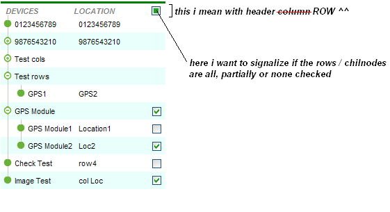
-) The second point is, is it possible to set a header column as a Tristate checkBox? Or at least an image?
I want to have a Tree, with each row can be selected, what should be represented in the header.
Please, your help is much appreciated
-the incredible Leitman
RE: Designing / decorating a WTreeView - Added by Koen Deforche almost 14 years ago
Hey,
You'll probably want to read a primer on CSS, with respect to the syntax for selectors.
.Wt-tree .Wt-noexpand { ... } selects DOM nodes with style class "Wt-noexpand" who have an ancestor DOM element which has style class "Wt-tree".
Thus. The "Wt-tree" class is set by Wt on each WTreeNode. Thus you could change it to "MyTree" and then have selectors like to control the style.
.MyTree .Wt-noexpand { ... }
If by 'header column', you mean the first column, you can add any widget to the labelArea() or is that not what you mean ?
Regards,
koen
RE: Designing / decorating a WTreeView - Added by Michael Leitman almost 14 years ago
Aaaahhh... thanks for another hint, Koen,
i already figured out, i should go more into deep,
how customizing due Css and JS works (in general and wt specific)
Eventually you can provide me a little code example, how i could get a specific TreeNode an set thus style?
If i write a style
".MyRedTree" with all ".Wt-noexpand, .Wt-expanded, .Wt-collapsed and .Wt-selected" (or similar) and setting all red Font and images,
and also the same green,
and then set the styleClass of the node to "MyRed/GreenTree"
this would be the correct way, if i understand?
What i meant by "headerColumn" is the first ROW (which columns are sortable) of the tree, not the col .
So i probably should call it "header row" instead, sry, my mistake.
I just managed to set text for the WStandardItemModel, using for example:
model->setHeaderData(0, Horizontal, WString::tr("text-to-translate"));
an set this model for the WTreeView
treeView->setModel(model);
I am also able to ->setIcon() or setCheckable() for WStandardItems, which then are added to the model per
model->appendRow(list of WStandardItems)
But how do i do this for the header Row?
Is it possible to set a Tristate CheckBox in the headline of the tree to signalize if the rows down under are checked? (all, none, some)
(because it is very difficult for me to explain my problem in english, a appended a screenshot, what i mean "Tree.PNG")
Thanks again Koen,
your answers are very helpful :)
RE: Designing / decorating a WTreeView - Added by Michael Leitman almost 14 years ago
Please, can anyone give me another helpful hint? :-s
For 6 days now, i tried all imaginable so resolve my problems,
but i don't come to a solution .
first:
set a TriState CheckBox in a Header of a TreeView AND/OR TreeTable
like i explained a post above.
second:
i played around with a TreeView, a TreeTable and so far with a Table,
but i didn't get it work so set the +/- images dynamically, for each Node
I tried to set CssStyle class of the Node for the WTreeTable, i want to change its image,
but this only worked for the ".Wt-noexpand : leaf icon",
the collapse/expand images did not change.
The Documentation of WTreeNode (http://webtoolkit.eu/wt/doc/reference/html/classWt_1_1WTreeNode.html#a5594488be1f49052915b4ecc840f44ce) mentions
The collapse and expand icons are fetched themselves as images, nav-plus.gif and nav-minus.gif
So is it not possible to have different collapse/expand images in one TreeNode?
third:
Is it possible to set the overflow in a column of a WTreeView to "overflow: visible;" ?
Or maybe merge cols?
Please, any help is really appreciated :-/
- the incredible Leitman
RE: Designing / decorating a WTreeView - Added by Koen Deforche almost 14 years ago
Hey,
1) WAbstractItemModel has headerData() and headerFlags() which can be used to indicate tri-state checkboxes.
You can also override the default item delegate for the header rows, which allows you to use any kind of widget in a header.
(WAbstractItemView::setHeaderItemDelegate())
2) Indeed, WTreeNode does not offer the flexibility: they are located using:
WApplication::resourcesUrl() + "themes/" + app->cssTheme() + "/nav-plus.gif" and "nav-minus.gif"
It would be straight forward to allows access to the expandIcon() in the API though, which is a WIconPair.
If you believe that would help you, please file a feature request and it'll make it in the next release (3.2.1).
3) No. That would be quite difficult to support (in combination with column resizing) in the way everything is implemented now.
Regards,
koen
RE: Designing / decorating a WTreeView - Added by Michael Leitman almost 14 years ago
Hey Koen :)
@1:
okay, now i can use a checkbox for a TreeView :)
But, WTreeTable doesn't use an ItemModel/-View? How is it possible to use a CheckBox in a WTreeTable?
@2:
BIG thank you, Koen, this would be awesome :D
I made a feature request, it would be really nice if i can set the expandIcon dynamically for each Node though the API :)
That was a really great help, i appreciate this :)
@3:
oh, too bad :(
But okay, then i think i am going to use ToolTips for the Text, if it is too long and doesn't fit the col size :)
best regards and thanks a lot
- the incredible Leitman